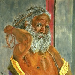
 Again another portrait inspired by the photography of my friend at Broken Compass (http://www.brokencompass.in/) during her trip to Rajasthan. A secret source to the breathtaking pictures that inspire some of my work. This particular picture brought in new challenges. As the title suggests the key was to get the expression perfect along with his action, the variant shades of the skin and the beard, the wrinkles on the face etc. I constantly feel the need to push the bounds and take up new challenges in terms of subject choice and this was part of that effort. As always the work was done on a 12" x 12" Uart sanded paper with a watercolor under-painting followed by a mix of Mungyo and Sennelier pastels.
1 Comment
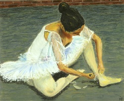 This was my second portrait subject inspired by a theme that is the favorite of Edgar Degas. He of course used soft or french pastels to paint them. I wanted to capture the transparency of the sleeve and get the texture in the dress and the posture of the dancer correctly which I believe I managed to accomplish.
What really makes paintings so much fun to me is almost 70% from the tools I use. When in comes to painting the material, the paper and additional equipment makes all the difference. Some of the equipment and pastels that I use are listed below.
Paper and mounting Drawing board: For mounting the paper for flatness and stability. Stathmore charcoal paper: Easy to work on and blend with finger, not great for a watercolor under-painting. Uart sander paper 500 grade: great for water color under-paint and very sturdy but its sand paper so watch your fingers while blending. I suggest using blenders and/or q-tips. Drafting tape: For mounting the paper to the drawing board. Easily removable and has a paper like surface to paint along the edges easily. Drawing and Under-painting Charcoal pencils: Great depth and very easy to draw with. Watch for smudging. Crayola color pencils: These are just used when I have more than one feature I watch to distinguish while sketching Reeves watercolor: I use this for under-painting (under-painting is where you lay out the main colors in different ares of your sketch before you start getting into the actual painting process). By adding a wash or a flat under-painting under different areas, you can eliminate the white flecks from white paper, create richer color or use complements to build interest. Oil pastels Sennelier 50 pastel box (Approx $2/pastel) Mungyo Artist's Extra Soft 72 pastel box (Approx $1/pastel) Additional tools Blenders and Q-tips Color shapers: Its like a paint brush but with a silicone tip to help with blending. Kitchen towels: To wipe my fingers to remove previous pastel color of colors from blending Easel: For plein air work primarily. 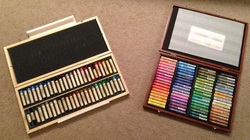 I use the following brand of pastels, Mungyo Artist's Extra Soft 72 pastel box (right, approx. $1/pastel), and Sennelier 50 pastel box (left, approx. $2/pastel). However there are lot of choice in pastels out there. Below, I discuss why I chose these pastels and what to look for in oil pastels.
There really is no one good pastel. However, on a broader range, there are good and bad pastels. The first and foremost and probably the most important is an oil pastel must not leave crumbs and must be creamy to apply and easy to blend. From brand to brand the creaminess of application and the softness can vary. As a rule of thumb, if you are new to oil pastels and plan to just give it a try, I would recommend you get a small pack of the really best quality pastels, why? cause choosing your oil pastels can literally make or break your spirit. When I started I bought a pack of Faber Castell pastels and was so disappointed when I used them almost immediately. It was hard to blend was not creamy on the surface and felt more like a crayon. After reading tons of reviews, I then pitched in for a box of Sennelier oil pastels. It was supposed to be the softest and creamiest of all oil pastels. Well, they also created the first professional oil pastels for Picasso so you couldn't go too wrong. Now these pastels do not come cheap and for someone wanting to just try them I would suggest that you get a 10 piece set or by individual pastel sticks in the colors of your choice in loose. I got the 50 piece box set and these were just amazing! The texture is that of painting with lipstick. They blend with each other like a dream and I have never seen anyone who has tried this not like it. These are also very soft so appliying firm pressure can break them easily. However, in large pastel works you can also use a lot of these pastels quickly so I was on lookout for a cheaper alternative. Again, after an extensive search I found Mungyo's Artist's Soft Pastels. Do not confuse this with the Mungyo oil pastels which is a student grade version. These are almost as soft as the Senneliers but a bit more affordable. It is also the second softest pastel in the market after Sennelier. I use this extensively for preliminary layers and then use the Sennelier over this. I do not plan to try any other pastels in the market for now. But there are tons of other brands available. Some of the professional grade pastels listed below are very creamy but are on the harder side compared to Sennelier. Caran'D ache Neopastel (Swiss) Sakura Cray Pass Specialist (Japanese) Holbein Oil pastels (Japanese) Erengi Art Aspirer pastel (China) I suggest you look at different websites to find the lowest rate for the particular product you want. Choose a good set of pastels and you will clearly feel the difference painting with them. 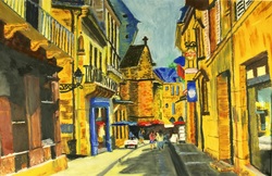 Inspired by a picture of the town architecture stores in Sarlat-France, this is so far my biggest work on a 12" by 18" Uart sanded paper. The perspective through the town street, the curvature of the street, the stores, the people and the materials, stone wood and metal all together make this a complex theme to work on given the bluntness of the pastel surface. Nevertheless I gave it my best. I realized that paintings with so much detail require a bigger canvas and higher level of patience. Completed on: 02/03/2013.
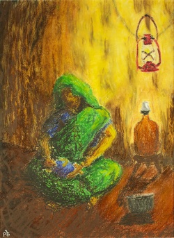 No pictures, nothing to look at, I sketched this from what I thought would be a scene depicting the mothers care. The lantern and the lighting from it are really meant to set the mood to the whole painting. Trending a little heavily towards impressionism, I obscured the details on the mother and have really just let the colors capture the scene. It is my first attempt at something different. Completed on: 02/09/2013.
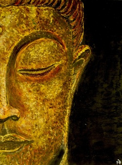 The sequel to "Buddha-Metal" is here. "Buddha-Stone showcases the right side of Buddha. Complementing the cool metal texture with the warm tones of the stone, this along with the Metal Buddha form a good pair. Completed on 02/05/2013.
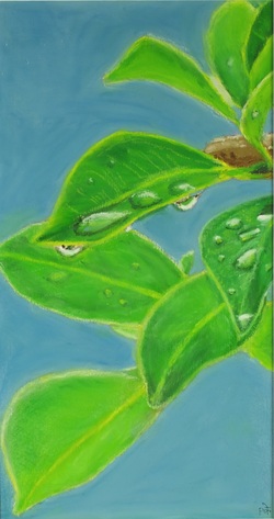 Another simple art piece done on a Uart sanded paper. This painting was done with the intent of capturing the leaves at different ;levels of focus and the dew drops reflecting the sky and the surrounding. Completed on: 01/25/2013.
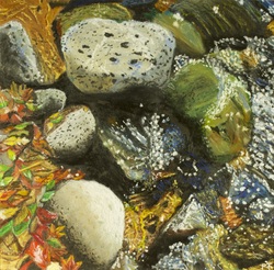 Another art piece inspired by the Oak Creek at Sedona. This particular painting was done on a Uart 500 grade sanded paper. Using part impressionistic texture and part pastel blending to achieve the realistic stone and water interaction was the key challenge. Also capturing the foliage was not easy. Completed on: 01/23/2013.
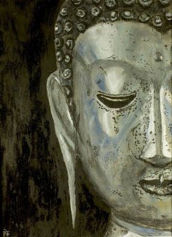 This particular piece was inspired by my wife picture choice. The challenge was in capturing the realistic metallic texture. Unfortunately I think no photograph does justice to the true nature of how the painting looks. This painting naturally has a sequel coming. Date completed: 01/19/13.
|
AuthorI am a self taught artist working with oil pastels, charcoal and acrylics. In my blog I share what inspires me and my work. Archives
November 2016
|
 RSS Feed
